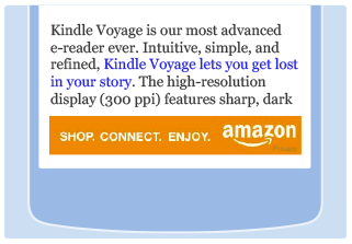
Mobile banners are available in the following sizes: 300x250, 320x50, and 125x125. You should choose a mobile banner size which matches the ad unit’s parent container size.
How do I integrate mobile banners?
- Navigate to the Banner Links page on AC
- Select a banner category to see all the available banner sizes in that category.
-
Choose among the available mobile optimized sizes (underlined in the following figure) and click to see the preview.

- Select ad-unit type: JavaScript (recommended) or iframe.
- Click on “Highlight HTML” button and copy the ad-code.
- Paste the copied code within the div in your website where you want the banner to appear.
Integrating Responsive Banners

If you have a
responsive website
, we recommend integrating the new responsive banners instead of fixed size banners. The responsive banner code automatically adapts the banner size to your page layout. The required size is calculated based on the width of the parent container. For example, if the parent container has width greater than 728 pixels, we will serve banner of size 728x90. If the parent container width is less than 728 pixels, we will serve banner of size 320x50.
If you don't know if your website is responsive, please
click here
.
How to integrate responsive banners?
- Navigate to the Banner Links page on AC
- Select a banner category to see all the available banner sizes in that category.
-
Choose among the available mobile optimized sizes (underlined in the following figure) and click to see the preview.

- Select ad-unit type: JavaScript (recommended) or iframe.
- Click on “Highlight HTML” button and copy the ad-code.
- Paste the copied code within the div in your website where you want the banner to appear.
Where can I integrate responsive banners?
Responsive banner currently support leaderboard or horizontal placements on the website.
Are all banners for all categories responsive?
Responsive banners are available for most of the popular categories. We are working to make them available for all the categories.
What if I do not want to use responsive banners or if it is not available for my category?
If responsive banner is not available for your category, we recommend using
- 728X90 size banners for the desktop website and 320X50 size banners for the mobile website.
- Banners of size 320X250 look good and aesthetically appealing on mobile devices.
- Do not use skyscraper banners on mobile websites. They do not offer good experience on mobile devices.
Should I use Image links or Banners?
Use mobile banners when you want to advertise a certain category, use image links when you want to advertise a specific product. Image Links may become stale if the product becomes unavailable or gets discontinued on Amazon. However, banners would always lead the customers to a category page where he/she has multiple available products to choose from.

