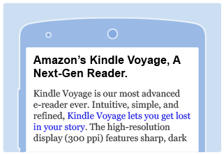
Customer engagement with content on mobile devices is growing. Your mobile websites and applications can benefit from this increased traffic when you use our mobile friendly products. To maximize monetization and deliver the best user experience on smartphones and tablets, we offer optimized ad units such as mobile banners, responsive banners and responsive widgets
The Mobile Education Center provides information on how to integrate Amazon mobile ad units with your mobile websites or applications.
Please visit our
Mobile FAQ
for more information.
Whats New
- Mobile Apps | Associates Program applications now being accepted from mobile app developers. Read more below or apply now
- Mobile Popover ad unit (BETA) | Learn more
Amazon Ad Units for Mobile Optimized Websites & Apps
Text Links

Text links allow you to build links to any page on Amazon website, including individual product detail pages, product category pages, search pages, and the Amazon home page. They can easily be included within blocks of text on your site, such as product reviews.
- Learn more about Integrating Text Links
Mobile Banners

Desktop banners sizes do not fit well on mobile optimized websites and hence cannot be used in mobile or responsive websites. To help you monetize your mobile websites, we started offering mobile banners in 2014. These banners support sizes which fit well on mobile screens. The banner creative is also optimized to engage with customers on mobile devices. The mobile banners are available in following sizes: 320x250, 320x50, and 125x125.
- Learn more about Integrating Mobile Banners
Responsive Banners

Until now, if you had a responsive website you had to write code to serve optimal banner size for each device. If you had separate mobile and desktop websites, you picked a different banner size for each website. Responsive banners allow you to integrate one banner code in your responsive, mobile or desktop websites and serve right banner sizes. Responsive banner currently supports leaderboard (horizontal banner) placement. The served banner size depends on parent container width. For example, if the container width is greater than 728 pixels, banner of size 728x90 is served. If the container width is less than 728 pixels, banner of size 320x50 is served.
- Learn more about Integrating Responsive Banners
Integrating with Blogging Platforms

Most popular blogging platforms do not serve header and side-rail ads on mobile devices. This section provides you information on how to integrate mobile ad units in popular blogging platforms such as BlogSpot so that Amazon ads are visible to the customers on mobile devices.
- Learn more about Integrating Blogging Platforms
Mobile App Integration

Reach your customer on popular mobile platforms and grow your revenue. Make your app content shoppable by adding links to any page on Amazon, including individual product detail pages, product category pages, search pages, and the Amazon homepage.
- Learn more about our Mobile Application Policy
